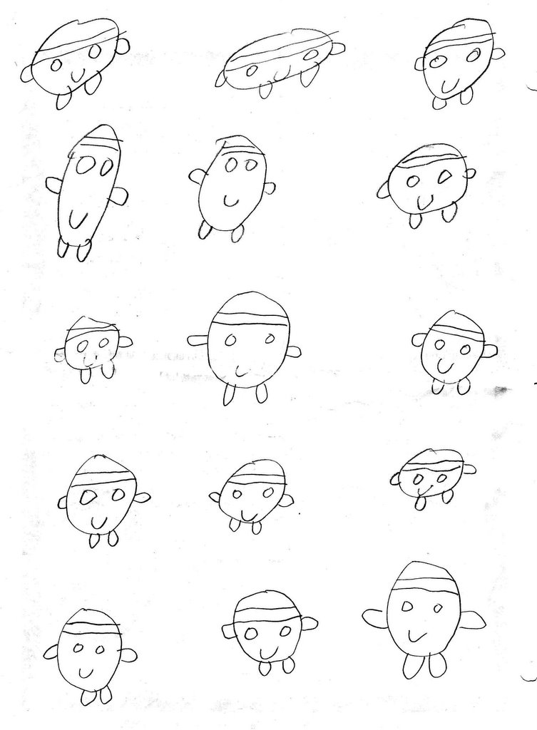
The little person who drew these little people was certainly on the right track.

Jim et Jean-Paul on vacation


Caption reads:
Jim et Jean-Paul portent un toast.


Caption reads:
Une scène typique des Tropiques.


Caption reads:
Les Chaises Longues
de l'Halcyon Days Hotel,
par Jean-paul et Jim

Caption reads:
L'école de requins.
AQUA CENTER.


Caption reads:
Remember the day I met you darling
It was under the coconut tree

Jean-Paul et Jim

Caption reads:
The beautiful private beach
of Jim and Jean-Paul.

Caption reads:
Jim et Jean-Paul surveillent
les requins... who's next?

Jim et Jean-Paul

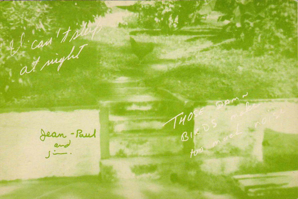
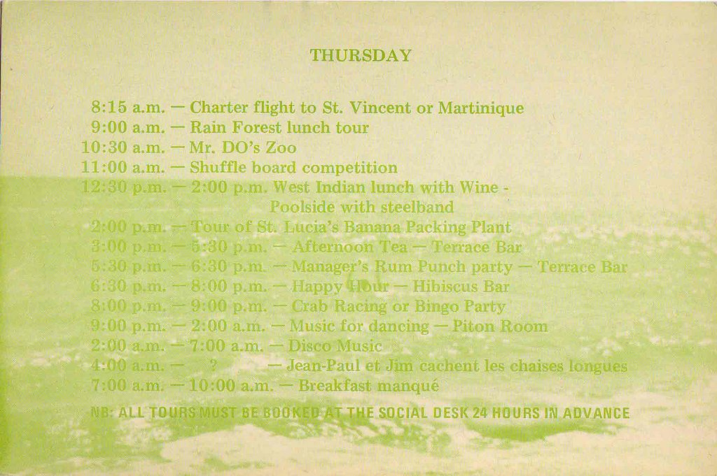
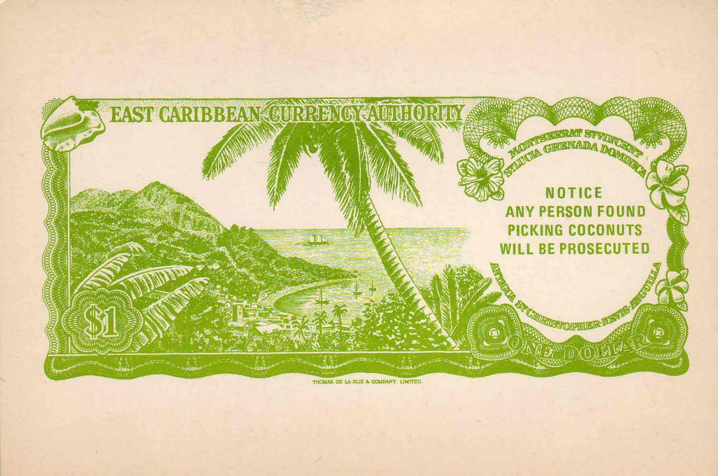
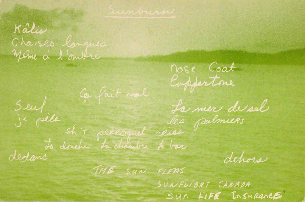
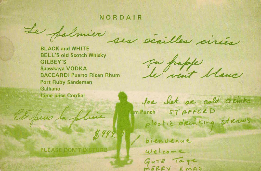
These guys, seemingly from Quebec, went on vacation in 1977, it seems, to St. Lucia and had their own postcards printed up, all in green with funny comments documenting their sunburns, bar tabs and snarky complaints.
I found a total of 8 different cards ( with several doubles!) in a batch of postcards I picked up for the shop.
I smartened up quick and pulled these from the shelves needing, somehow, to share their uniqueness before they sold.
They are now in my private collection and I'd love to meet these guys and ask them about their trip.
Front:

Back:
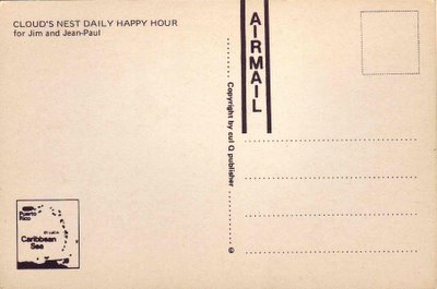
(each card has a different caption in the top lefthand corner of the back)
Also note the publishers' copyright: cul Q.
Cul = ass, btw.
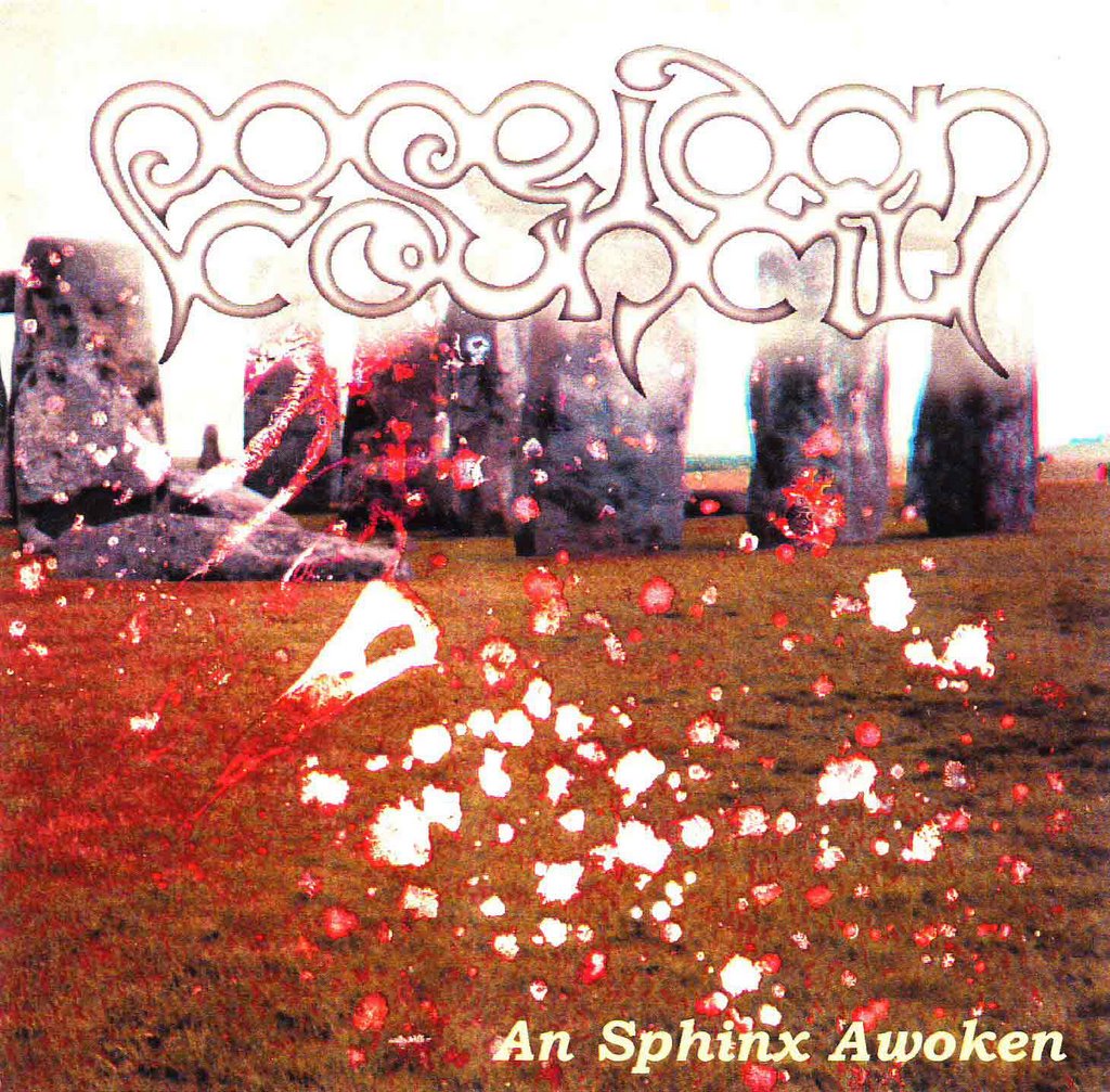
Poseidon Council


In 2002 Sam Shalabi and I
laughed our heads off making a very serious prog record,
An Sphinx Awoken. Our band ? Poseidon Council.
This is the record sleeve I made at the time for our grand opus.
We released maybe ten copies into the world.
Now this underground classic is available from notype as downloadable files.
They gave it a snazzy new cover.
Have a listen...but know that Merlin, too, is listening!

Scrap Book


I tend to keep scrapbooks at work, no matter what job I have.
These books tend to be the repository of tiny scraps that I can't bear to let go.
This is the inside front cover of the most recent book started in April 2003.
Slow to fill.

Artyping

My 1955 La Salle Elementary Bilingual Method Typewriting Course handbook mentions :
'The "La Salle Complementary Course" offers a complete 30-page chapter on artistic typewriting.'
There is also use of the word 'artyping'. My first encounter with it.
Here are some excerpts.


" We are pleased to mention here how greatly we are endebted to Mr. Julius Nelson of
Baltimore, expert sponsor of art-typing, for his personal guidance, and his generosity
in valuable and original specimens."

Oh, Julius! I'd love to see some of those original specimens!

Question

Is an overall aesthetic emerging here on these pages ?

I find it interesting what I am uploading
Stuff that's very different from
My personal art.

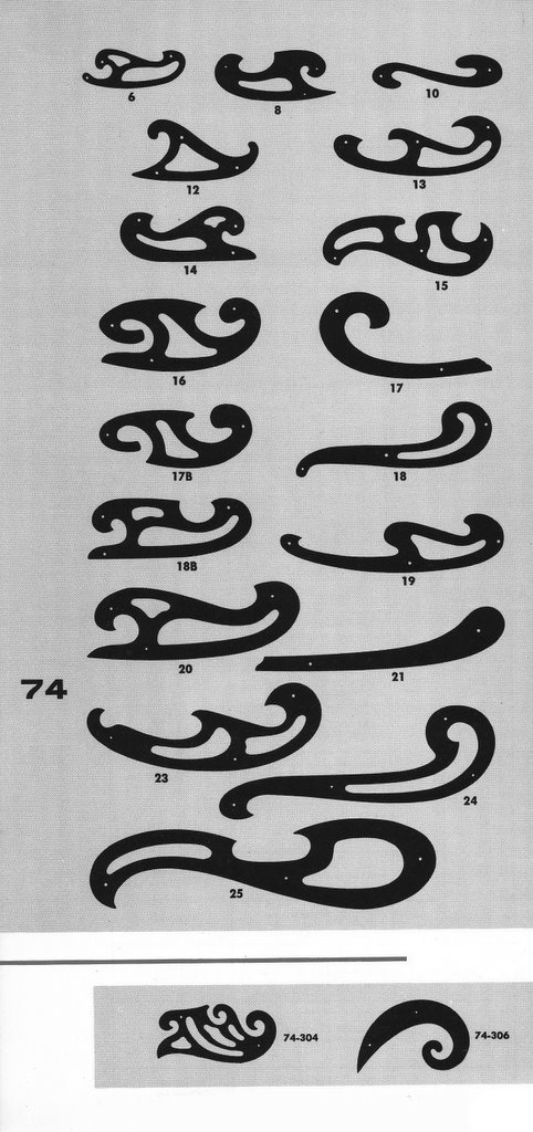
Transparent Irregular


French Curves
from BRUNINGs
Seventeenth General Catalog : Section Five
Engineering And Drafting Instruments And Supplies
1963

I thought they looked pretty all to a page.

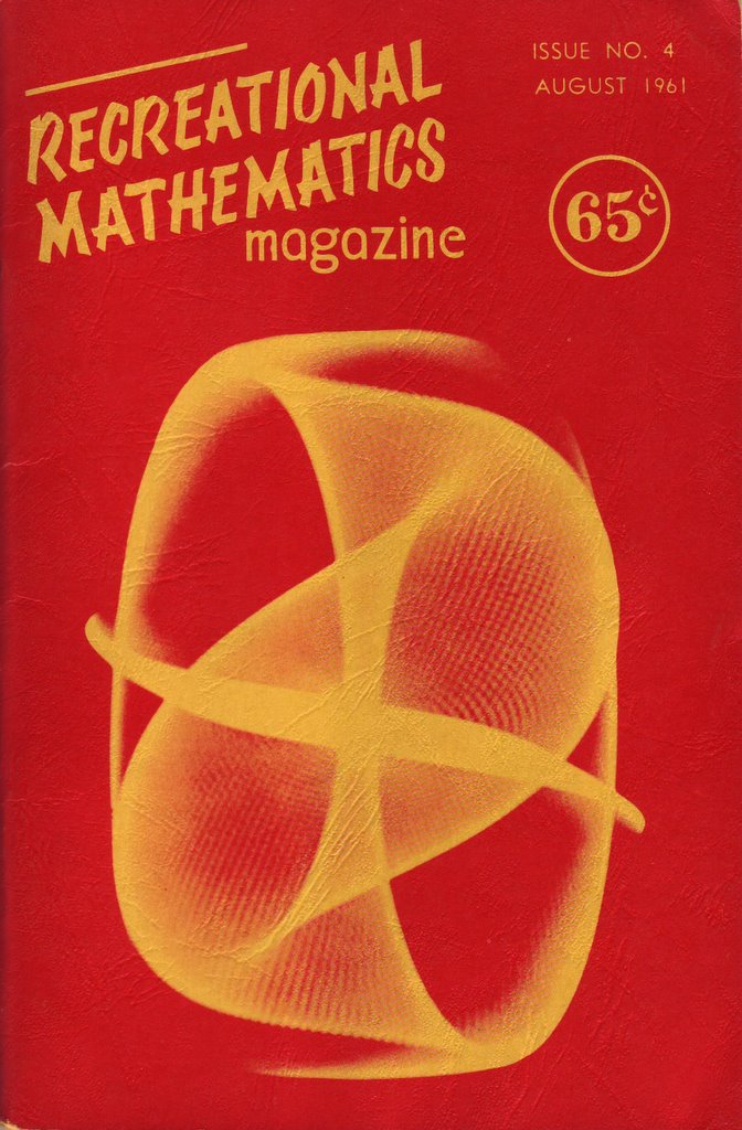
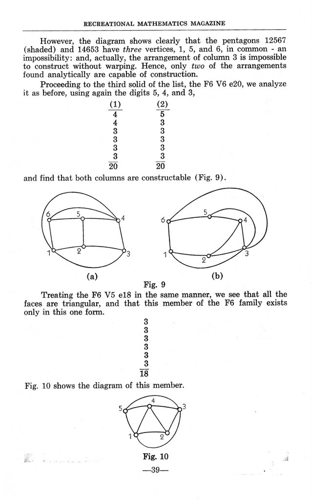
Recreational Mathematics

More beauty I don't understand.
A cover from 1961


Sample pages from another issue

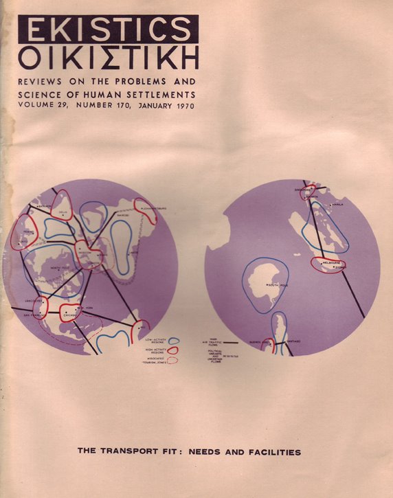
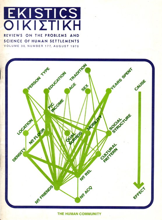
Ekistics


Reviews on the problems and science of human settlements.
Two issues from 1970
When I got my greedy little hands on these my heart skipped a beat.
I'm a geek for things I don't understand...if their aesthetic is just right!

Montreal Bus Transfers

Here is a sample of the old transfer discontinued sometime in the early 1970s
(Thanks to John Trivisonno for a generous donation of vintage transfers)


Replaced by this kind (shown is a Lucky 7, a transfer with 7 intact arrows, no cut offs)

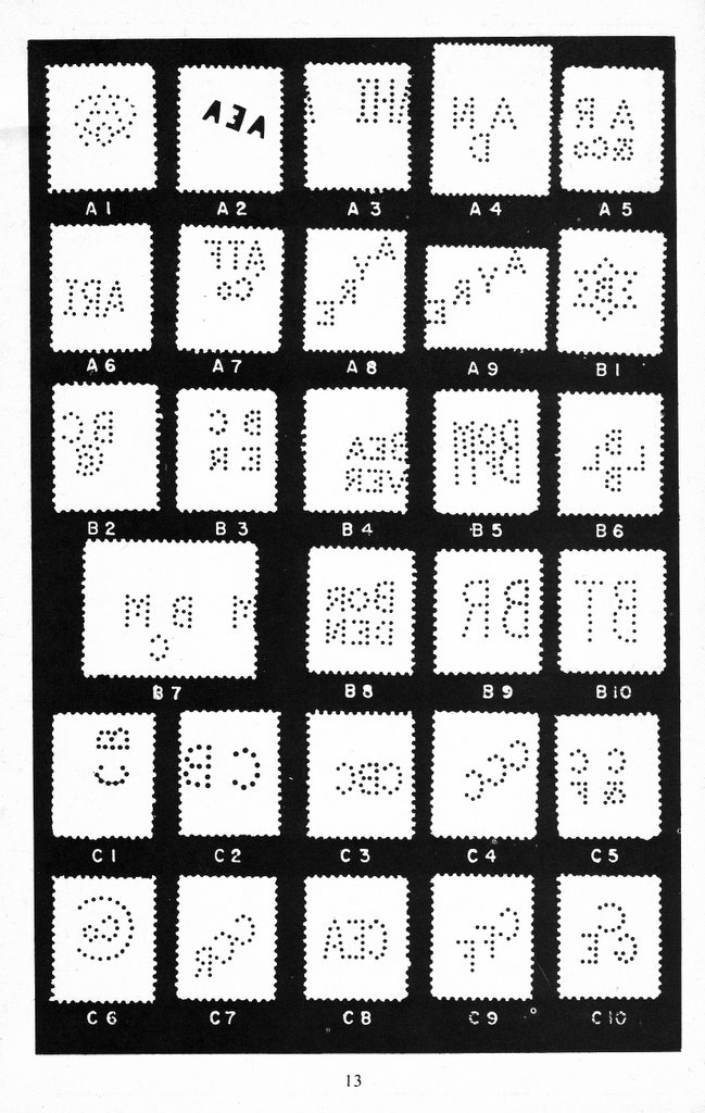
Canadian Stamps w/ Perforated Initials

Third Edition
Reprinted 1979

That's the name of the booklet the page below comes from.
Quite beautiful stuff.

Nine Documents

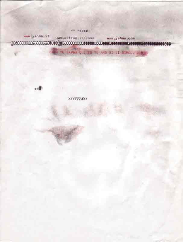
The nine texts below date from a few years back and were created
For a group art show. They are xeroxed pages (8.5 x 11) aged via
Tea and sunlight. They are also my first items on this blog that I have
Scanned in as opposed to creating on the computer or nabbing from a
Friends site. Or a strangers.